Design
Unleashing Creativity with Cherry
At Cherry, we believe in empowering designers and developers to create exceptional user experiences. Our design system focuses on the essential building blocks—those crucial elements that form the backbone of any interface. While it may seem extensive, rest assured that these elements play a pivotal role during the development phase.
The Crucial Elements
- States and Interactions: Cherry defines states like hover, focus, and active. These are the subtle yet impactful transitions that enhance user engagement.
- Accessibility: Designing for everyone is a priority. Cherry ensures that your interfaces are accessible to all users, regardless of their abilities.
- Freedom to Create: Creativity knows no bounds. Unlike rigid systems, Cherry doesn’t impose unnecessary rules. The canvas is yours—design interfaces that inspire and delight.
The Figma Community Template
Where do you begin? Start with our Figma community template. It’s the launchpad for your design journey. Here’s what it offers:
- Figma Variables: Store color tokens, grid gap sizes, max width values, media queries, padding,radius, and typography values. These variables keep your design consistent and adaptable.
Template Structure
Explore the Cherry template organized into the following sections:
- Thumbnail: A sneak peek into the world of Cherry.
- Colors: The vibrant palette and dark mode variants.
- Typography: Where words meet aesthetics.
- Buttons: The gateways to interaction.
- Inputs: Where user input meets elegance.
- Shadows: Adding depth and dimension.
- Site Images: Icons and thumbnails for your app.
- Web: Bridging design and development.
- Components: Building blocks for your interfaces. Feel free to adapt this structure to fit your specific needs. Happy designing!
Download Template
Download the Cherry Design System template from the Figma Community.
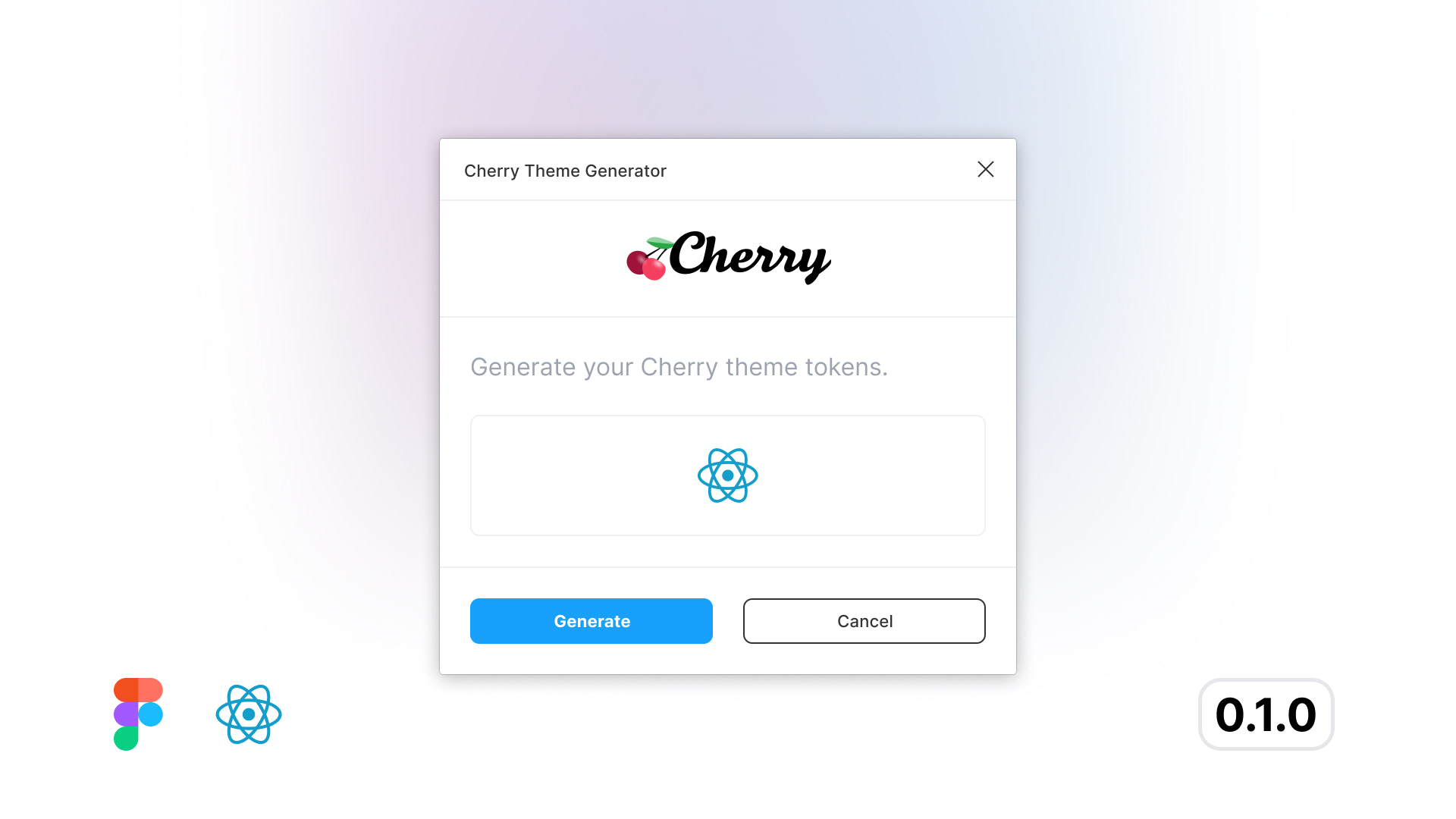
Download Plugin
Download the Cherry Theme Generator plugin from the Figma Community.