Figma - Design
When embarking on the design process, Figma is an excellent tool to kick things off. Here are some essential steps to get started:
1. Download the Template from Figma Community
Begin by obtaining a template from Figma Community. This serves as your foundation for the design work.

2. Working Areas in Figma: Sections
Keep in mind that Figma’s working areas are organized into Sections. These are distinct spaces where you’ll create and manage different aspects of your design.
- 🌐 Site Images: This page deals with the icons associated with a website or application. Favicons, open graph images, etc.
- 🌍 Web: Here, you’ll focus on the overall web design.
- 🧩 Components: Components are reusable design elements that streamline your workflow.
3. Figma Variables
Cherry uses Figma variables to store design values. These values are then used to create design tokens. Figma variables are organized into groups, each with a specific purpose.
- Colors: Colors values for dark and light themes.
- Font Family: Font families for text, headings and mono-spaced fonts.
- Font Sizes: Font size definitions for mobile and desktop.
- Font Weights: Font weights for text, headings and buttons.
- Grid Gaps: Grid gaps are used to create a visually appealing design.
- Line Heights: Line heights definitions for mobile and desktop.
- Max Width: Max width values are used for
xsandxxl. - Media Queries: Breakpoint definitions for
xs,sm,md,lg,xl,xxl,xxxl. - Padding: Padding sizes for
xsandlg. - Radius: Border radius values for
xs,lgandxl.
4. Text Styles
Adjust typography definitions from the Figma variables. You’ll see a live preview of the changes on the ✍️ Typography page.
5. Local Styles
Local styles are only used for shadows. You’ll see a live preview of the changes on the ☁️ Shadows page. There are two sets of shadows, one for dark mode and one for light mode.
6. Additional Pages for Preview
Beyond the working areas, you’ll find specific pages:
- 🎨 Colors: Preview color variations.
- ✍️ Typography: Explore different text styles.
- 👆 Buttons: Button variations and states.
- 👉 Inputs: Inputs variations and states.
- ☁️ Shadows: Various shadow evelevation styles.
Remember, Figma empowers you to create beautiful designs efficiently. Happy designing!
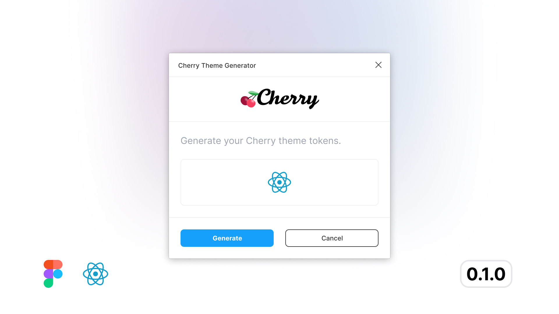
7. Extract Design Tokens
Once you are done with your designs, Cherry has it's own Figma Plugin to extract design tokens automatically. The plugin will give you the theme file, all you have to do is copy and paste it. Easy game! You can install the plugin from the Figma Community.
