Colors Dark - Design
In addition to the primary color palette, we provide the same variables for Dark Mode. This feature allows seamless switching between light and dark modes with a single click in Figma.
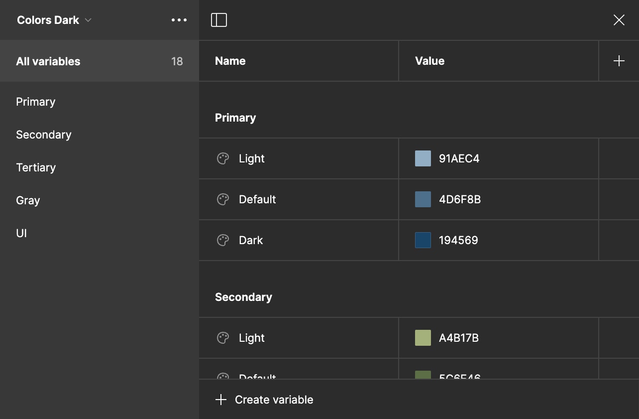
Primary Light#91AEC4
Primary#4D6F8B
Primary Dark#194569
Secondary Light#A4B17B
Secondary#5C6E46
Secondary Dark#354C2B
Tertirary Light#EBCCB9
Tertirary#816B5A
Tertirary Dark#675445
Gray Light#1A1A1A
Gray#454444
Gray Dark#808080
Success#84CC16
Error#EF4444
Warning#EAB308
Info#06B6D4
Dark#000000
Light#FFFFFF
The colors can be found in the Figma Template in the 🎨 Colors page.